Wednesday, 30 December 2009
Tuesday, 29 December 2009
In what ways does your media product use, develop or challenge forms and conventions of real media products? (i.e. of film openings)
Monday, 28 December 2009
How does your media product represent particular social groups?
Saturday, 26 December 2009
What kind of media institution might distribute your media product and why?
Who would be the audience for your media product?
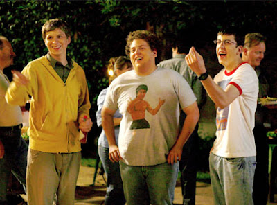
In media we created the target audience for our film, the ideal person that would go watch it, to aim towards in advertising.
We went with the main characters in 'Superbad'
How old are they- 17 and a half
What are they called- Rolliax
How do they dress- Casual, Hoodie and jeans
Where do they live- Anywhere on earth
What do they spend their money on- Games (Quake, COD, Halo), clothes (Hoodie and jeans), movies (Snatch, Kidulthood)
Where do they watch films- DVD, internet, cinema
What kind of music do they like- Pop music (So solid crew), download music
Leisure time- Socialising, facebook
How much TV do they watch- 2-3 hours per day
What is their favorite film- Pulp fiction
Monday, 16 November 2009
How did you attract/address your audience?
Friday, 13 November 2009
Rating for Film Opening
Wednesday, 11 November 2009
What have you learnt about technologies from the process of constructing this product?
Tuesday, 10 November 2009
Looking back at your preliminary task (the continuity editing task), what do you feel you have learnt in the progression from it to full product?

Sunday, 1 November 2009
Christina and angelica's rough cut
Strengths:
- Establishing shots are well placed
- Good use of natural light to give an eerie feel
- Text effects are impressive, the way they jitter in gives the viewer the sense of a horror or maybe supernatural film
- Font used also gives of supernatural feel
- Placement of props (drills, blocks of wood) describe a gritty, workshop environment
- Doesn't give away too much of the story and not too little
Weaknesses:
- Music is good at the beginning but loses dramatic effect when the strings come in
- Shot after the title "something wicked" doesn't seem to have a lot going on or anything interested to catch the eye compared to the other shots
- Replace shot after main title with new establishing shot or remove the shot
- Keep the music nice and simple without the need for strings or find a way to make the strings fit more with the overall loop (i'm not sure whether you guys made it with garageband or not)
- Maybe more shots of the protagonist entering the room (more foot shots?)
Sunday, 18 October 2009
Film relating to ours
Filming
CYA!
Thursday, 15 October 2009
Final idea
4 example 25 word pitches
Egomania by Paul Alexander and Simon Braithwaite - Hotshot young lawyer Michael Stark becomes so successful, so arrogant and so full of himself that his ego decides to go solo - with disastrous consequences.
The Cleaner by Peter Michael Rosenberg - When a crime scene cleaner haunted by his past uncovers evidence that suggests LAPD cops are working as assassins, he becomes their next target.
Shoeless Joe by Andrew Clyde - A holiday of a lifetime across the desolate heart of the Australian outback turns into a living nightmare for five friends.
Storage by Chris Denne and Matt Winn - Terror stalks a storage facility. Survival for those trapped inside depends on the secrets in those endles
Fontboard
Greenscreen activity
Making my ident


Tuesday, 13 October 2009
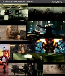
Moodboard for film
Monday, 12 October 2009
List of props
Fake pistol
Balaclava's
Car
Dolly?
Fish eye lens
2 different alarm clocks
Clock
Two tooth brushes
Crew list
Max Phillips
Elliot Hickey
Rob Williams
Performers:
Max Phillips
Elliot Hickey
Rob Williams
One other voice actor
Sunday, 11 October 2009
My logo
It is composed using only two pictures. A cartoon monkey looking at a banana and a cartoon piece of chicken. I chose the name Bumbaklot productions because i planned to do a jamaican style logo. I animated the monkey moving in and the chicken flying in using final cut and found a music loop from garageband as the background music. I recorded my own voice on garageband to animate the "Jerk Chiicken" phrase. I've always liked logo's that were quirky and different which is why i like my logo. Its not over complicated and it's fun to watch.
CYA!
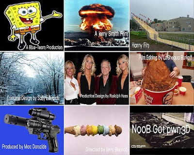
Our own 9 frames
Saturday, 10 October 2009
Resevoir dogs title sequence
Continuity Editing
In my opinion i think we succeeded in demonstrating all of these techniques the match on action is smooth, the dialogue seems to flow as in a conversation and we didn't break the 180 degree rule.
Tuesday, 6 October 2009
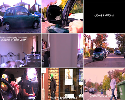
Credits list
A Long Road Film
(cast) David Skinner
(cast) Sam Dilan
(cast) Alison Ford
Costume Design by James Hendon
Art Direction by hannah Manson
Production Design by Tom Bennit
Casting by Anna Ross
Film Editing by Dorn Samson
Cinematography by Dody Zimmer
Original Music by Sean Scott
Produced by Elliott David
Directed by Jamse Handson
Main Title.
PITCHES!
Monday, 28 September 2009
Sunday, 27 September 2009
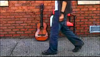
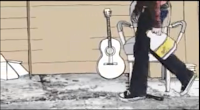
Juno Opening
Monday, 21 September 2009
Feedback
This blog will be the evidence of your research and planning for the AS coursework, so there needs to be lots on it and lots of detail to it.
Thursday, 17 September 2009
Photoshopping postcard
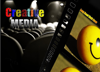
- 3 different images
- cropping
- rasterizing
- layer effects (inner glow, outer glow etc)
- magic wand tool to remove areas i didn't need
Wednesday, 16 September 2009
Student Film opening
I chose the first one i found which was another students at long roads film
STRENGTHS:
- Heart beating sequence adds tension well
- Camera shots work well to add urgency to the sequence
- Music works well in some of the shots
- Music doesn't progress much and gets a bit boring after awhile
- Acting at the end (runner stops and is grabbed) is not very good
- Black and White filter is unnecessary
- Title at the end is a little too big
3 film openings
I chose the opening to
Magnolia
Pineapple Express
and Visioneers
I like the opening to Magnolia the most.
The entire sequence is not aimed to introduce the audience to the different characters but instead to set the mood and overall feel of the film. For those who chose not to watch the intro it is simply a description of three remarkably coincidental events.The narration for the sequence is great because the voice has a michael moore feel to it which makes you think that the events being described are actual fact or based upon (which they very well may be). The opening is great and i would recommend anyone to go and see the whole film.
:D
CYA!
Final cut
CYA!
Film opening!
Here is what me and yasmin made
CYA!
Tuesday, 15 September 2009
Moodbooard
We were shown a storyboard for a scene for the film Shifty. We were told to create the moodboard based upon what we thought the visual style of Shifty would be like if we made it.
CYA!


